Page 10 of 42
Re: Guess what the Graph Shows!

Posted:
Mon Oct 20, 2014 5:40 amby Мастер
I have a really hard time trying to come up with reasons why that's close . . .
Re: Guess what the Graph Shows!
Posted:
Mon Oct 20, 2014 7:08 amby tubeswell
Мастер wrote:I have a really hard time trying to come up with reasons why that's close . . .
cos if you squint really hard it kinda looks like this?

Re: Guess what the Graph Shows!
Posted:
Mon Oct 20, 2014 7:16 amby Мастер
Well, they're both graphs.
Re: Guess what the Graph Shows!
Posted:
Mon Oct 20, 2014 8:44 amby Lianachan
Мастер wrote: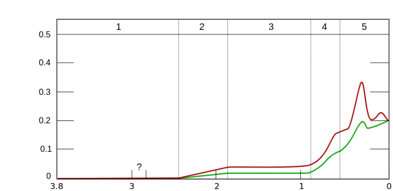
The top axis is the day of the working week, the lower axis is the number of impossible things I still have to complete that week and the Y axis is the number of fucks I give about it all?
Re: Guess what the Graph Shows!
Posted:
Mon Oct 20, 2014 2:16 pmby tubeswell
Lianachan wrote:Мастер wrote:
The top axis is the day of the working week, the lower axis is the number of impossible things I still have to complete that week and the Y axis is the number of fucks I give about it all?
I vote for this!
Re: Guess what the Graph Shows!
Posted:
Mon Oct 20, 2014 2:42 pmby Lianachan
tubeswell wrote:Lianachan wrote:Мастер wrote:
The top axis is the day of the working week, the lower axis is the number of impossible things I still have to complete that week and the Y axis is the number of fucks I give about it all?
I vote for this!
I'm pretty sure it's right. Oh, the green is with coffee and the red is without coffee.
Re: Guess what the Graph Shows!
Posted:
Wed Oct 29, 2014 4:04 pmby Мастер
The horizontal axis measures time.
Re: Guess what the Graph Shows!
Posted:
Wed Oct 29, 2014 4:55 pmby tubeswell
Dammit if Lianachan's answer isn't correct.
Re: Guess what the Graph Shows!
Posted:
Wed Oct 29, 2014 6:49 pmby Arneb
Would it be too much of a giveaway to tell us which unit the y axis has?
Re: Guess what the Graph Shows!
Posted:
Wed Oct 29, 2014 9:13 pmby Мастер
Arneb wrote:Would it be too much of a giveaway to tell us which unit the y axis has?
It is a fraction of a whole, so it has a theoretical minimum of zero and a maximum of one.
The two lines mark the upper and lower confidence bounds.
Re: Guess what the Graph Shows!
Posted:
Sat Nov 01, 2014 3:32 amby Мастер
The units along the horizontal axis are quite large amounts of time.
Re: Guess what the Graph Shows!
Posted:
Sat Nov 01, 2014 6:58 pmby Arneb
OK, let's try Big.
The numbers on the lower x-axis are billions of years, while the numbers on the upper one represent Ages of the Earth. Maybe the question mark is during the putative Snowball Earth period, and the red and green linees represent estimates of atmospheric oxygen content, conveniently converging at the just over 20 % mark we are seeing in the current era. The border between epochs 4 and 5 would then be the Precambiran/Cambrian transition, at a something like .55 Gy ago. And the "recent" spike would be some time during Cretacious, when, as I seem to recall foggily, there was a spike in atmospheric O2 reaching almost 40 %.
Does that even make sense?
Re: Guess what the Graph Shows!
Posted:
Sat Nov 01, 2014 11:56 pmby Мастер
Arneb wrote:OK, let's try Big.
The numbers on the lower x-axis are billions of years, while the numbers on the upper one represent Ages of the Earth. Maybe the question mark is during the putative Snowball Earth period, and the red and green linees represent estimates of atmospheric oxygen content, conveniently converging at the just over 20 % mark we are seeing in the current era. The border between epochs 4 and 5 would then be the Precambiran/Cambrian transition, at a something like .55 Gy ago. And the "recent" spike would be some time during Cretacious, when, as I seem to recall foggily, there was a spike in atmospheric O2 reaching almost 40 %.
Does that even make sense?
Gut gemacht!
Re: Guess what the Graph Shows!
Posted:
Sun Nov 02, 2014 6:50 amby Lance
Arneb wrote: there was a spike in atmospheric O2 reaching almost 40 %.
When the bugs got REAL BIG!
Re: Guess what the Graph Shows!
Posted:
Mon Nov 03, 2014 8:47 pmby Arneb
Lance wrote:Arneb wrote: there was a spike in atmospheric O2 reaching almost 40 %.
When the bugs got REAL BIG!
Yeah, they had dragonflies with one mete wingspans back then, and now that you've mentioned it, I think their existence was attributed to the high oxygen concentrations in the Cretaceous. Must have made for nice wildfires, too.
Re: Guess what the Graph Shows!
Posted:
Mon Nov 03, 2014 9:05 pmby Arneb
Re: Guess what the Graph Shows!
Posted:
Mon Nov 03, 2014 11:04 pmby Мастер
Is the horizontal axis age, and the vertical axis heart rate?
Re: Guess what the Graph Shows!
Posted:
Tue Nov 04, 2014 2:03 amby Lance
Arneb wrote:Lance wrote:Arneb wrote: there was a spike in atmospheric O2 reaching almost 40 %.
When the bugs got REAL BIG!
Yeah, they had dragonflies with one mete wingspans back then, and now that you've mentioned it, I think their existence was attributed to the high oxygen concentrations in the Cretaceous. Must have made for nice wildfires, too.
Exactly. There's only so big an animal that respires through its exoskeleton can get. More oxygen available = bigger bug.
Re: Guess what the Graph Shows!
Posted:
Tue Nov 04, 2014 9:34 pmby Arneb
Мастер wrote:Is the horizontal axis age, and the vertical axis heart rate?
No to both, but age plays a role her. Note that by vertue of the different coulours, the plot contains three dimenions of information.
Re: Guess what the Graph Shows!
Posted:
Tue Nov 18, 2014 2:40 pmby Arneb
I guess I should give some hints to get things going again.
The y axis is in percent. All bars add up to 100 %, counting all the subgroups.
The x axis counts years up to some recent date (2010) I think.
Re: Guess what the Graph Shows!
Posted:
Tue Nov 18, 2014 3:19 pmby Heid the Ba
Are the coloured bands age related?
Smoking?
Re: Guess what the Graph Shows!
Posted:
Tue Nov 18, 2014 7:01 pmby Arneb
Age related, yes: They represent the age distribution of something thorugh the years.
Smoking, plausible, but no. The change is too quick for that. I must say, when I saw this graph I was rather struck by what it shows (the data, significantly, are for Germany, not, say, subsaharan Africa

)
Re: Guess what the Graph Shows!
Posted:
Tue Nov 18, 2014 10:29 pmby MM_Dandy
New cases of HIV?
Re: Guess what the Graph Shows!
Posted:
Wed Nov 19, 2014 6:49 amby Arneb
Not quite, but very close.
Re: Guess what the Graph Shows!
Posted:
Wed Nov 19, 2014 9:08 amby Heid the Ba
If I'm reading this correctly it is something young people used to get but older people get now?