Page 16 of 42

Re: Guess what the Graph Shows!

PostPosted: Wed Sep 16, 2015 7:15 pm
by Arneb
Arneb wrote:Image


You and your smutty little brain you. I didn't even get what you were aiming at. No no, this is hard, tough social medicine.

Re: Guess what the Graph Shows!

PostPosted: Wed Sep 16, 2015 7:38 pm
by Lance
Income?

Re: Guess what the Graph Shows!

PostPosted: Wed Sep 16, 2015 8:33 pm
by Arneb
Not quite.

Re: Guess what the Graph Shows!

PostPosted: Wed Sep 16, 2015 10:24 pm
by Lance
Money spent on health care?

Re: Guess what the Graph Shows!

PostPosted: Thu Sep 17, 2015 7:02 am
by Arneb
No. But both your guesses are in the general vicinity (and they are cerainly ancillary to the true parameter).

A very general measure is sought here. The number of dots is no coincidence, because that's all the data points you can take.

Re: Guess what the Graph Shows!

PostPosted: Thu Sep 17, 2015 8:07 am
by Heid the Ba
Countries rather than individuals? Life expectancy -v- per capita GDP?

Re: Guess what the Graph Shows!

PostPosted: Thu Sep 17, 2015 9:07 am
by Arneb
That's it EXACTLY. It't the reason why the 200-odd data points in the graph aren't a sample, they are all there is.

I love the graph because it shows that we in te "West" are deeply into a region of diminishing returns: Above 10.000 per annum, the gains in life years from higher income become weaker, and with a GNP of, say, Kazakhstan, Brazil or Argentina, you can provide a health care system that is rather close to optimal in terms of the "hard currency" of medicine, life expectancy.

BTW, the U.S., spending the most per capita on health care in the world (>$ 8300 p.a., a third more than the nearest neighbour) is 34th in the world in life expectancy.... :-

I don't know why these things are flying through my head. Probably because I am a socialist....

On to you, Heid! :=D:

Re: Guess what the Graph Shows!

PostPosted: Thu Sep 17, 2015 2:43 pm
by Мастер
Arneb wrote:That's it EXACTLY. It't the reason why the 200-odd data points in the graph aren't a sample, they are all there is.


Still a sample :)

Arneb wrote:I love the graph because it shows that we in te "West" are deeply into a region of diminishing returns: Above 10.000 per annum, the gains in life years from higher income become weaker, and with a GNP of, say, Kazakhstan, Brazil or Argentina, you can provide a health care system that is rather close to optimal in terms of the "hard currency" of medicine, life expectancy.

BTW, the U.S., spending the most per capita on health care in the world (>$ 8300 p.a., a third more than the nearest neighbour) is 34th in the world in life expectancy.... :-

I don't know why these things are flying through my head. Probably because I am a socialist....

On to you, Heid! :=D:


So what kind of ultra-crappy country has a life expectancy just above 30?

https://en.wikipedia.org/wiki/List_of_c ... expectancy

2013 WHO study puts Sierra Leone dead last, at 46; Lesotho is the next one up, at 50. A UN 2009-2012 study put a bunch right around 46 (Central African Republic bringing up the rear, at 45.91).

Could the graph be old? (Let's say, several decades old?) Or might it be male life expectance? The same link above shows a "Global Burden of Disease" 2010 study, which puts male life expectance in Haiti at 32.5 (female 43.6), but the next one up (male or female) are female in Haiti and male in Central African Republic, tied at 43.60.

The CIA list at the bottom of my linked page doesn't show any countries in the low 30s, male, female, or overall.

Re: Guess what the Graph Shows!

PostPosted: Thu Sep 17, 2015 3:16 pm
by Мастер
Hmm, come to think of it, if the graph is old, that would give us a problem with the units on the income axis. Unless it's denominated in Hong Kong dollars or something like that.

Re: Guess what the Graph Shows!

PostPosted: Thu Sep 17, 2015 3:49 pm
by Lance
I think I'm going to move to Lesotho. I can be a wise, old sage there.

Re: Guess what the Graph Shows!

PostPosted: Thu Sep 17, 2015 4:09 pm
by Heid the Ba
Do these things take account of all deaths? So life expectancy at birth might change wildly if your country turns to shit when you are 18.

Re: Guess what the Graph Shows!

PostPosted: Thu Sep 17, 2015 4:09 pm
by Heid the Ba
Lance wrote:I think I'm going to move to Lesotho. I can be a wise, old sage there.

I could be an angry old man there. "Get off my patch of dirt and take your hippity hop music with you!"

Re: Guess what the Graph Shows!

PostPosted: Thu Sep 17, 2015 4:10 pm
by Arneb
Мастер wrote:
Arneb wrote:That's it EXACTLY. It't the reason why the 200-odd data points in the graph aren't a sample, they are all there is.


Still a sample :)

Of course, as I should have known... :oops:

Мастер wrote:So what kind of ultra-crappy country has a life expectancy just above 30?

https://en.wikipedia.org/wiki/List_of_c ... expectancy

2013 WHO study puts Sierra Leone dead last, at 46; Lesotho is the next one up, at 50. A UN 2009-2012 study put a bunch right around 46 (Central African Republic bringing up the rear, at 45.91).

Could the graph be old? (Let's say, several decades old?) Or might it be male life expectance? The same link above shows a "Global Burden of Disease" 2010 study, which puts male life expectance in Haiti at 32.5 (female 43.6), but the next one up (male or female) are female in Haiti and male in Central African Republic, tied at 43.60.

The CIA list at the bottom of my linked page doesn't show any countries in the low 30s, male, female, or overall.

I already forgot where I lifted the graph from. The Wikipedia page was my starting point, but I don't know where my track led me.

Re: Guess what the Graph Shows!

PostPosted: Thu Sep 17, 2015 4:13 pm
by Arneb
Heid the Ba' wrote:Do these things take account of all deaths? So life expectancy at birth might change wildly if your country turns to shit when you are 18.


Life expectancy is a highly derived figure. The definition says that it counts the years a newborn today would have in front of him/her IF all conditions remained equal to today's.

Re: Guess what the Graph Shows!

PostPosted: Sun Oct 04, 2015 4:04 am
by Lance
Can I jump in here with a quick one I just ran across until heid is ready?

PieChart.png

Re: Guess what the Graph Shows!

PostPosted: Sun Oct 04, 2015 5:02 am
by tubeswell
^The top^ of one of the Giza Pyramids

Re: Guess what the Graph Shows!

PostPosted: Sun Oct 04, 2015 5:51 am
by Lance
That was quick.

Here it is with the key:

PieChart.png

Re: Guess what the Graph Shows!

PostPosted: Sun Oct 04, 2015 8:56 am
by Arneb
Heid, would you mind if tubes jumped in? You seem to have ben awfully short of graphs lately.

Re: Guess what the Graph Shows!

PostPosted: Sun Oct 04, 2015 4:40 pm
by Arneb
A little postscript on Mactep's last chart: Slate is discussing that the U.S. is really a very violent country, and they produce this graph - don't we know that one? :D It even shows the 9-11 bump, but all these interesting little fact get pasted over by very, very forceful smoothing of the curve.

Mental note: You can produce a line of best fit for ANY data...

Re: Guess what the Graph Shows!

PostPosted: Sun Oct 04, 2015 9:14 pm
by Heid the Ba
I'm no good with graphs so anyone who wants can jump in.

Re: Guess what the Graph Shows!

PostPosted: Mon Oct 05, 2015 5:08 am
by Мастер
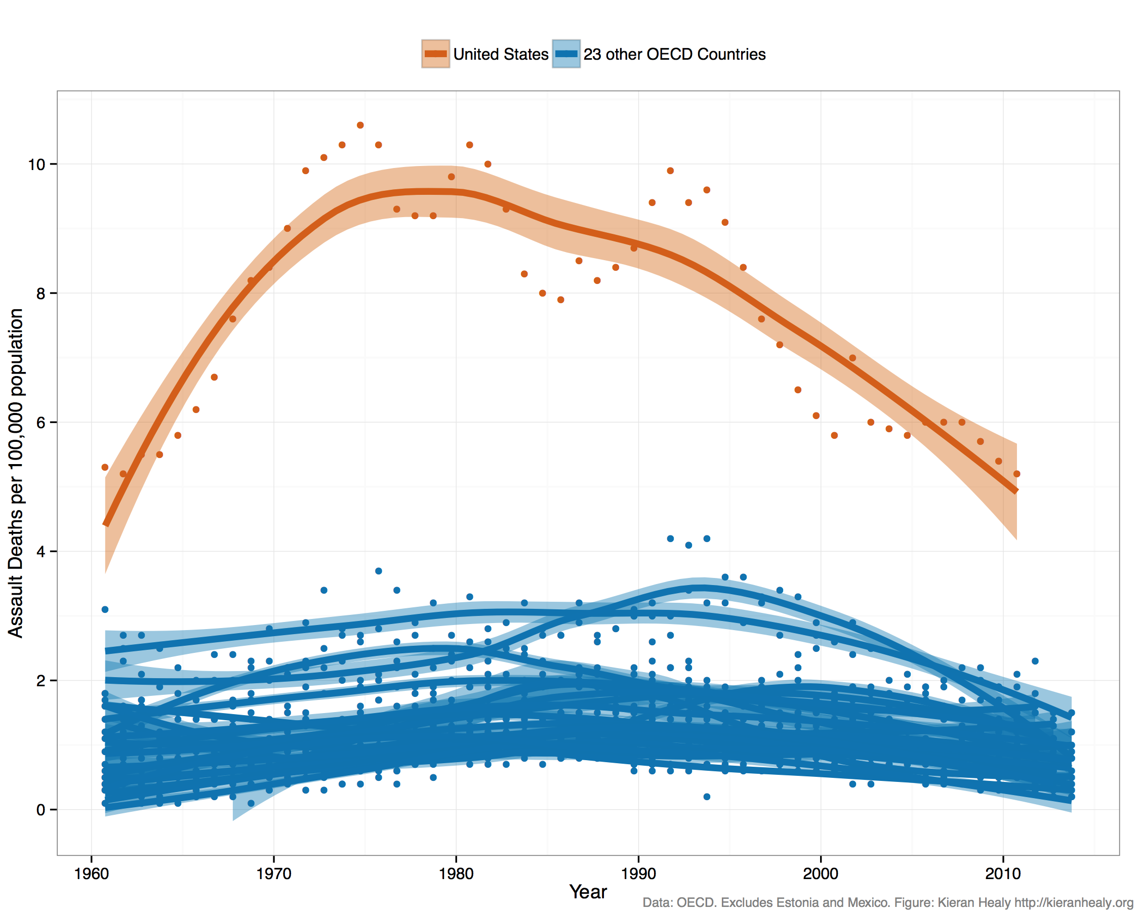
Arneb wrote:A little postscript on Mactep's last chart: Slate is discussing that the U.S. is really a very violent country, and they produce this graph - don't we know that one? :D It even shows the 9-11 bump, but all these interesting little fact get pasted over by very, very forceful smoothing of the curve.


Feckin' awesome! I'm going to use that one. Many thanks (guess what German phrase gets changed to "Violin Dank" by the spellchecker?), this will be very useful.

Arneb wrote:Mental note: You can produce a line of best fit for ANY data...


And when you don't confine yourself to the rather limiting world of straight lines - the possibilities are endless.

Re: Guess what the Graph Shows!

PostPosted: Mon Oct 05, 2015 7:21 am
by tubeswell
Мастер wrote:... Many thanks (guess what German phrase gets changed to "Violin Dank" by the spellchecker?), this will be very useful..


:-({|= :glp-1rof1:

Re: Guess what the Graph Shows!

PostPosted: Tue Oct 13, 2015 12:13 pm
by Arneb
tubes, it's your turn now, since Heid has abdicated his graphy throne.

Re: Guess what the Graph Shows!

PostPosted: Fri Oct 23, 2015 5:12 am
by Lance
Here's one:

Graph.png

Re: Guess what the Graph Shows!

PostPosted: Fri Oct 23, 2015 9:49 am
by Lianachan
Is the y-axis age?