Page 20 of 42
Re: Guess what the Graph Shows!

Posted:
Sat Apr 30, 2016 10:28 amby Мастер
Arneb wrote:I'll give to Mactep, understanding "Mist" as death.
By "Mist", I meant "Mist" - the unpleasant smelling liquid produced by people suffering from "stomach" flu, a disease apparently not really related to influenza.
Arneb wrote:On to you Mactep - except if you didn't mean "death" when you wrote "Mist". In that case, the cigar goes to the boss (even though vaccination doesn't play a role her. It's the entire country that is in these graphs).
Re: Guess what the Graph Shows!
Posted:
Sat Apr 30, 2016 10:51 amby Arneb
Oh, I see. "Stomach flu" is indeed not related at all to influenza.
So, it's Lance's turn then.
Re: Guess what the Graph Shows!
Posted:
Sat Apr 30, 2016 5:29 pmby Lance
Submitted for your guessing pleasure:
Re: Guess what the Graph Shows!
Posted:
Sat Apr 30, 2016 5:55 pmby tubeswell
Official reported incidents involving UFOs (by government department) Blue is USAF, Green is the US Marines, NASA is Yellow (in flames), Grey is CIA, Black is black ops...
Re: Guess what the Graph Shows!
Posted:
Sat Apr 30, 2016 6:57 pmby Lance
Wow, close enough. Marines are light green, Army is dark green, Teal is the Navy. How did you get that so quickly?
Re: Guess what the Graph Shows!
Posted:
Sat Apr 30, 2016 10:42 pmby tubeswell
Lucky guess. (X-files theme song playing softly in my head right now)
Re: Guess what the Graph Shows!
Posted:
Sat Apr 30, 2016 11:28 pmby Lance
tubeswell wrote:Lucky guess. (X-files theme song playing softly in my head right now)
I was kidding. That's not it.
Guess again.
Re: Guess what the Graph Shows!
Posted:
Sun May 01, 2016 8:28 pmby Lance
The graph quantifies something that I've discussed elsewhere recently.
Re: Guess what the Graph Shows!
Posted:
Mon May 02, 2016 12:29 amby tubeswell
Llama fecundity according to pasture type. bright green is pastureland, dark green is jungle, brown is desert, aqua and blue are mirages, black is Gulf of Mexico after the deep water horizon spill, grey is the back paddock behind Area 51.
Re: Guess what the Graph Shows!
Posted:
Mon May 02, 2016 12:42 amby Lance
*sigh* no
You're getting even with me for all the chemtrail stuff in Arneb's graph, aren't you?
Re: Guess what the Graph Shows!
Posted:
Mon May 02, 2016 5:24 amby tubeswell
Llama fertility then. Same pasture types.
Re: Guess what the Graph Shows!
Posted:
Mon May 02, 2016 8:22 amby Heid the Ba
Arneb wrote: You may be unaware of it, but mortality is a highly seasonal phenomenon,
As us private client lawyers say, "a cold spell always culls the weak from the herd".
Re: Guess what the Graph Shows!
Posted:
Mon May 02, 2016 8:50 amby Arneb
Must you really confirm all my evil-lawyer prejudices?
Re: Guess what the Graph Shows!
Posted:
Mon May 02, 2016 11:29 amby Arneb
Lance wrote:The graph quantifies something that I've discussed elsewhere recently.
Number of people who watched Breaking Bad on its first run, by episode?
Re: Guess what the Graph Shows!
Posted:
Mon May 02, 2016 12:25 pmby Мастер
Arneb wrote:Lance wrote:The graph quantifies something that I've discussed elsewhere recently.
Number of people who watched Breaking Bad on its first run, by episode?
In the US. Based on your comment, I've actually been able to find the graph.
Re: Guess what the Graph Shows!
Posted:
Mon May 02, 2016 12:59 pmby Arneb
Ok, I'll wait for the Boss' confirmation - Funnily, I thought that "oin the first run" implies "in the U.S.", but that may not be necessarily so...
Re: Guess what the Graph Shows!
Posted:
Mon May 02, 2016 2:51 pmby Мастер
Arneb wrote:Ok, I'll wait for the Boss' confirmation - Funnily, I thought that "oin the first run" implies "in the U.S.", but that may not be necessarily so...
I hadn't really thought about that, but I suppose that's true.
They do advertise television shows here as appearing "The Same Day as the US!" which is a bit odd, as we are 12 hours ahead of New York, and 15 hours ahead of Los Angeles. Does that mean we actually get them before the US?
Re: Guess what the Graph Shows!
Posted:
Mon May 02, 2016 4:43 pmby Lance
Arneb wrote:Number of people who watched Breaking Bad on its first run, by episode?
Yup, that's exactly right.
There are more and more shows that play globally these days, so I guess they would have to play elsewhere before here. And there are several joint venture shows that play elsewhere weeks before they make it to the US.
Re: Guess what the Graph Shows!
Posted:
Mon May 02, 2016 5:34 pmby Arneb
Мастер wrote:Arneb wrote:Ok, I'll wait for the Boss' confirmation - Funnily, I thought that "oin the first run" implies "in the U.S.", but that may not be necessarily so...
I hadn't really thought about that, but I suppose that's true.
They do advertise television shows here as appearing "The Same Day as the US!" which is a bit odd, as we are 12 hours ahead of New York, and 15 hours ahead of Los Angeles. Does that mean we actually get them before the US?
I don't know, but I do know that "Le Beaujaulais Nouveau Est Arrivé" is a big thing in Japan because they DO get to taste it earlier than almost everyone else.

Re: Guess what the Graph Shows!
Posted:
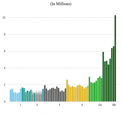
Thu Jun 16, 2016 3:35 pmby Arneb
Re: Guess what the Graph Shows!
Posted:
Thu Jun 16, 2016 3:57 pmby Lance
Those breaking points seem odd. Anything at all to do with income?
Re: Guess what the Graph Shows!
Posted:
Thu Jun 16, 2016 4:08 pmby Arneb
Extremely indirectly, maybe, but don''t pursue it.
The breaking points sure are odd, but they derive from some physical measure. Broadly speaking, we semm to be dealing with a logarithmic quantity.

Re: Guess what the Graph Shows!
Posted:
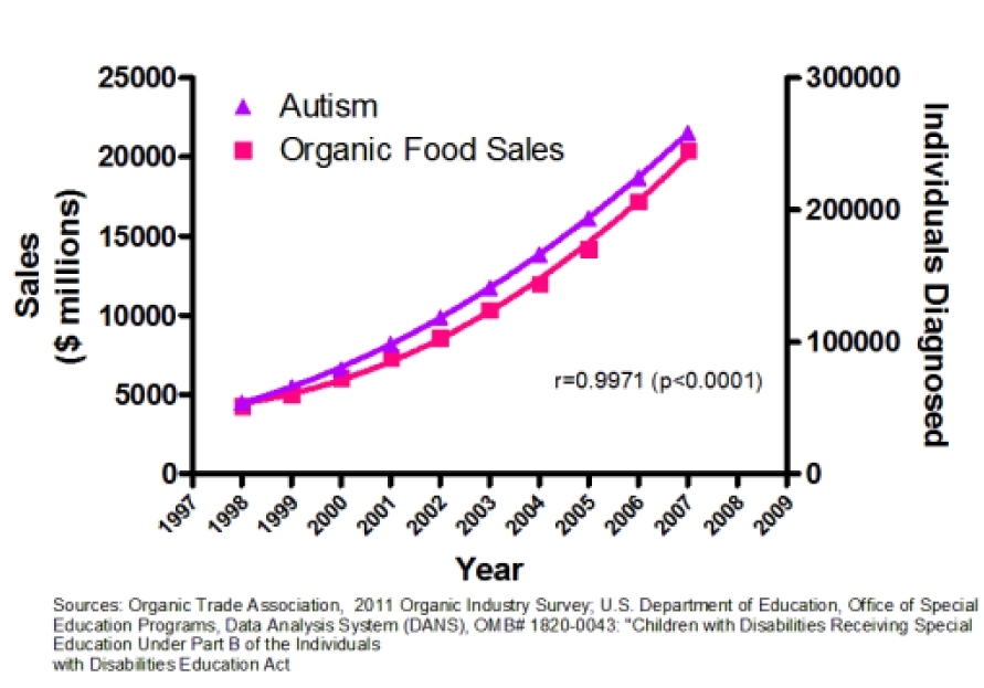
Thu Jun 16, 2016 4:49 pmby Lance
Not for the game, I left the labels intact. I just love this graph and figured this was as good a place as any to share it. It shows how
cases of Autism correlate with the rise in organic food sales.
Re: Guess what the Graph Shows!
Posted:
Sat Jun 18, 2016 4:22 amby teri tait
Well this is easy, it's the membership of the Ulluminati R Us from it's radical beginnings in the early years and the terrible persecutions of the nineties which culminated in the surge of power and prosperity as the mellenials jumped on board.
Re: Guess what the Graph Shows!
Posted:
Sat Jun 18, 2016 7:50 amby Arneb
Hmmm, I'd say rather it has a connection to astronomy.